Harman Eye Center is a high quality eye care and surgery center with nine locations throughout Virginia. They are committed to providing excellent service and compassionate care for each of their patients. Recently Harman Eye Center contracted the Randall Branding Agency to complete a fresh branding strategy for them. By working closely with the client, we were able to build a new strategy from the ground up that accurately conveys the core message and offerings of the Harman Eye Center. The clients were happy with the result as was the team here at Randall Branding. Read the case study and let us know what you think!
Harman Eye Center approached Randall Branding to completely revamp their current look and feel. They felt that their brand was out-of-date and needed an upgrade in order to stay competitive in their industry.
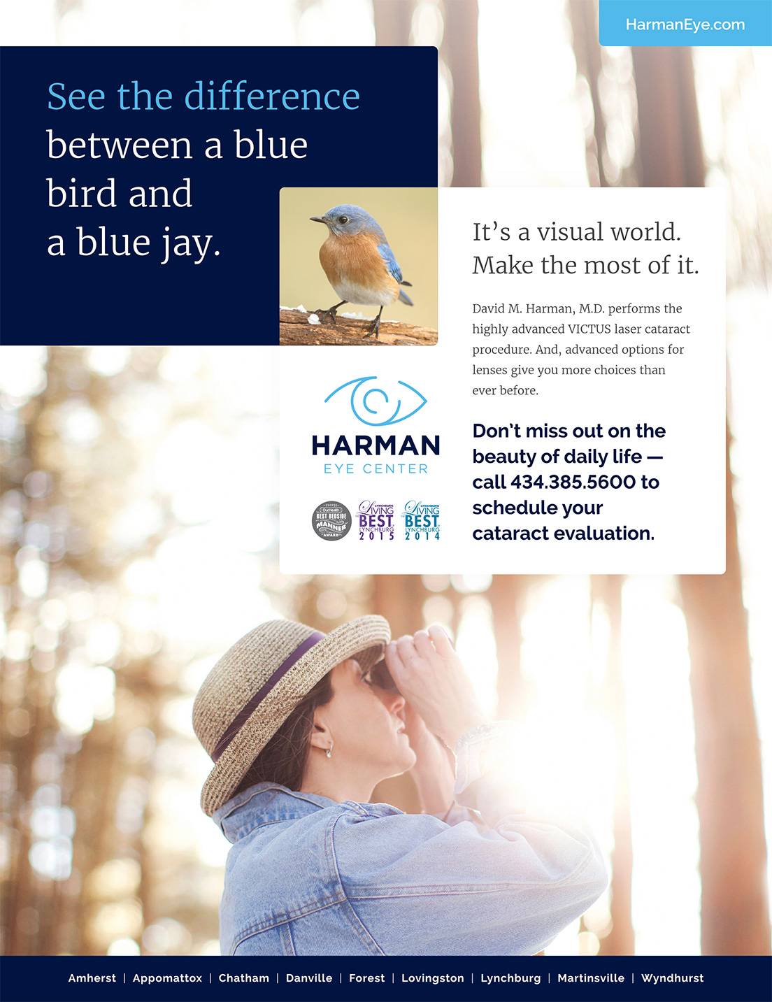
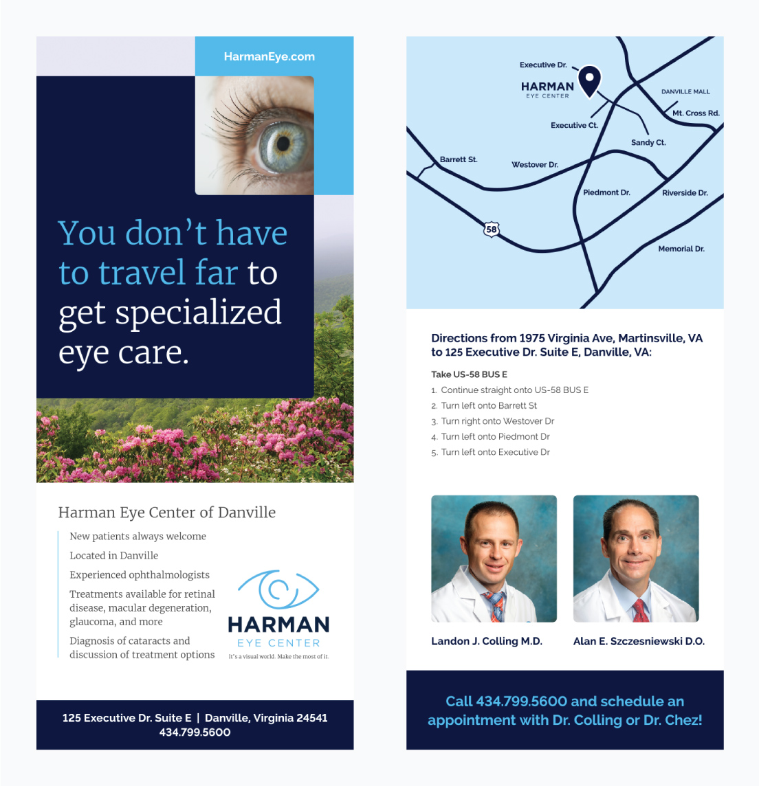
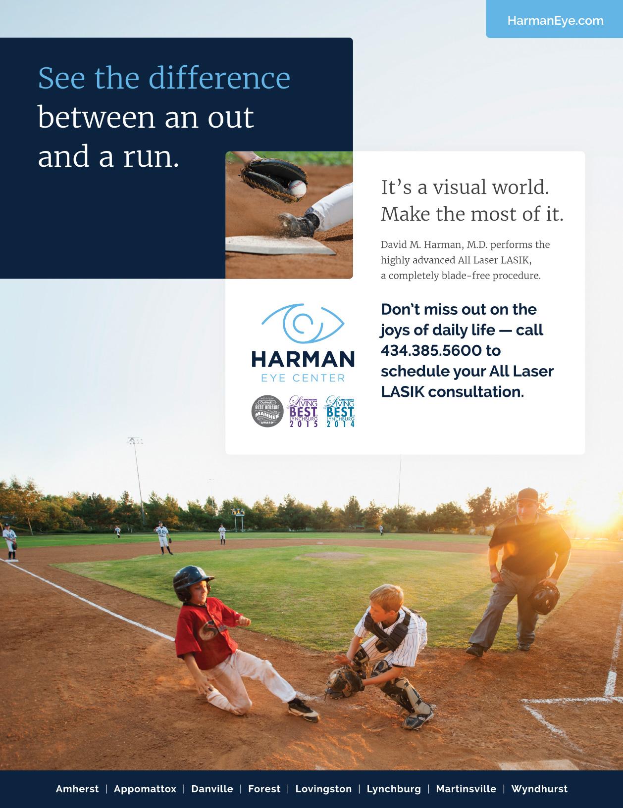
We worked closely alongside Harman Eye Center to design a new logo and build a website that is clean and mobile-friendly. We also created a messaging platform, to set a direction for all website content and print materials. Formulated around the It’s a Visual World campaign, all collateral adheres to a consistent look and central message. Harman Eye Center’s new identity sets them apart from competitors with more streamlined visuals and patient-centered messaging.

Logo Design
Our goal was to create a brand that would magnify Harman Eye Center’s unique attributes in a competitive industry, as well as increase their overall success. Since launching their modern and user-friendly website six months ago, Harman is seeing more engaged users on their site and a 15% lower bounce rate compared to last year. Harman Eye Center has already opened a 9th location since the launch. Additionally, recurring magazine advertisements and rack cards are raising brand awareness and increasing their overall patient count.


